• HOME
  • ABOUT
  • WORKS
  • SERVICES
  • CONTACT

SCROLL

WORKFOUR

2024
Visual identity

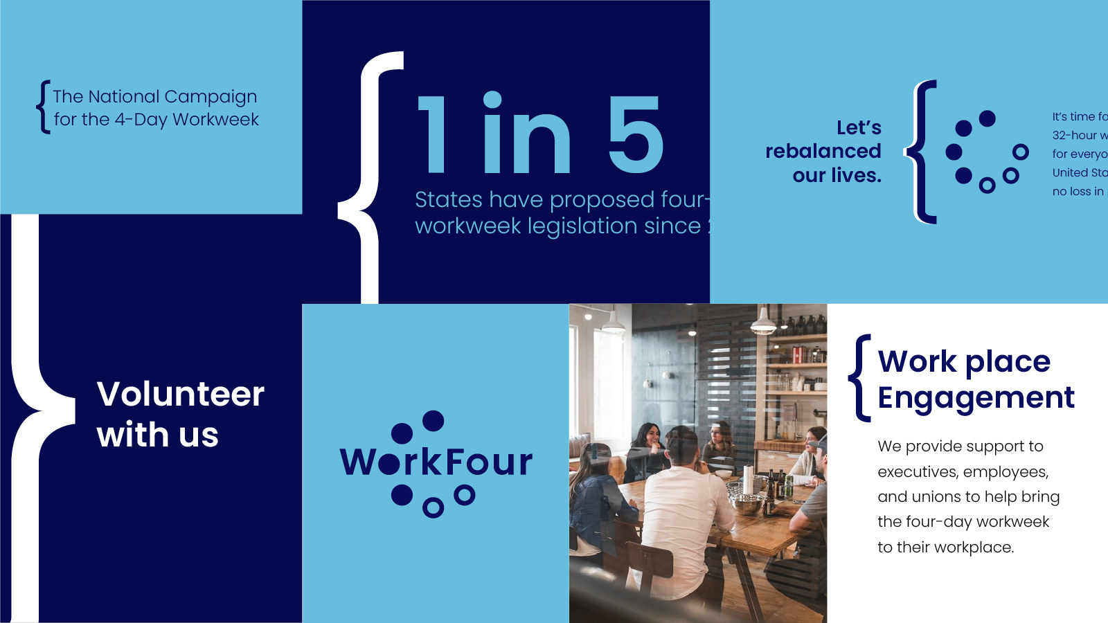
WorkFour is the only nonprofit in the United States dedicated exclusively to advancing the four-day workweek. Founded in 2019 in partnership with the 4 Day Week Global Foundation, WorkFour advocates for a more balanced, sustainable future of work. In developing their logo, we explored a wide range of typefaces and configurations. Early in the process, it became clear that the design would benefit from a distinct visual element. The shared “o” in both “Work” and “Four” emerged as a natural focal point—an opportunity to visually communicate the organization’s mission. We designed a symbol within the “o” that represents the seven-day week: four days of work and three days off. This is conveyed through a circular mark composed of seven segments—four filled, three unfilled—capturing the essence of the WorkFour vision in a simple yet memorable form.

Shapes of color with a large dramatic angle of a logo layered on top. Made in Adobe Illustrator.
Image with dark blue background with a number of logos on them. The logos all have typogarphy and a series of circles and dots. they are all blue and white in color. Designs made in Adobe Illustrator.
An image of 7 rectangles with typography and a bracet simbol in each. The color of the rectangles are either dark blue or cyan blue. Designs are made with Adobe Illustrator and Adobe Indesign.
An image of an ipad on a wooden table. The screen of the ipad has a white background with logos and proportions. Made in Adobe Illustrator and Adobe Indesign.
An image of an ipad on a wooden table. The screen of the ipad has a white background with logos and directions of what not to do to the logo. Made in Adobe Illustrator and Adobe Indesign.

Contact us


  • ©
    2025 Scitalis Design LLC

  • INFO@SCITALISDESIGN.COM

  • IG@SCITALISDESIGN

  • ETSY@SCITALISDESIGN

  • VISUAL IDENTITY
  • GRAPHIC DESIGN
  • ART DIRECTION
  • ILLUSTRATION
  • BRAND / IDENTITY AUDIT
  • DESIGN CONSULTING